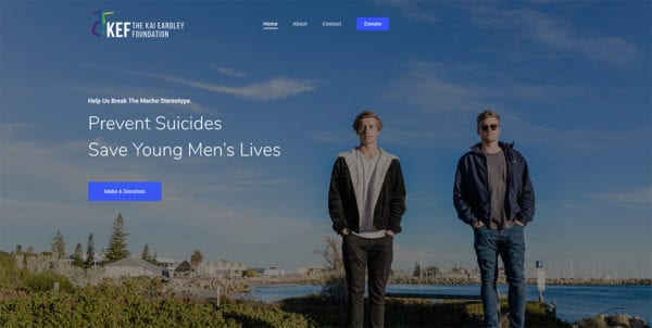
When she first approached me in May this year, Claire said she wanted the brand to be corporate and sleek. And she believed she needed to match the brand to the official name, the Kai Eardley Foundation, after having jumped through so many hoops to create a charitable foundation with ACNC.
I never set out to change someone’s mind. Especially not in this context. But I do ask questions.
She lost her middle son Kai in 2016 to suicide.
Since then, she has dedicated her life to raising awareness about suicide among young men and raising funds to support Tomorrow Man in order to deliver emotional resilience workshops for schools in WA.
I didn’t start out by saying she didn’t need corporate and sleek.
I simply asked why she was doing all that work.
We were at a busy cafe.
When I asked that question, both our eyes welled up with tears. I was holding mine back with all my might.
Why do you do it?
The answer to that question was all I needed to say yes to taking on this project.
Personally, it was going to be a new kind of branding work.
This project wasn’t really about making photos.
This was about setting up a direction for a serious charitable organisation.
I had to be sure.
Could I take her on a journey of discovery?
I said yes.
Then the magic happened. *
We are here now with:
- A brand new visual identity
- Strong brand message & positioning.
Corporate & sleek? No
Professional & effective? I’d like to say, absolutely yes.
Branding is more than just photographs.
*Of course, it isn’t magic. A lot of emotional labour goes into the whole process. There were several coaching sessions and video messages. I don’t want to go on and on here with all the details. But perhaps I could share those details in a different format.


